
Imagine if your reader opened your book and was immediately blown away by nothing more than the style of your chapter heading designs. The fonts and artwork that you could potentially put in that space can be every bit as enticing as the first line in your story.
And yet most authors don't take advantage of chapter themes in books. Why? Because, until recently, there were few software programs that gave you this capability. And those that did were so advanced, that only experienced graphic designers knew how to use them.
But not anymore.
Today, with programs like Atticus, there are a variety of ways to style and create beautiful chapter themes for your books. Or you could hire this out to a professional formatter.
Regardless of your approach, this article will help you understand the basic layout and design strategies to create amazing chapter headers for your book.
- How to create amazing chapter themes
- The differences between ebook and print chapter themes
- Examples of beautiful chapter themes
Why You Should Trust Me
So I've been writing and formatting books for a long time. 10+ years as of this writing.But I actually found formatting to be a huge pain, which is why I actually created my own formatting software that solved all my problems. I called it Atticus.But this isn't meant to be a sales pitch. I just want to make sure it's clear that I know what I'm talking about. The amount of research that went into not only formatting my own books, but also creating a formatting software is huge.I researched everything, from tiny margin requirements, to the specific type of quotes to use (curly or straight, it makes a difference).And yes, of course, that includes how to format beautiful chapter themes.So if all that makes sense, hopefully you'll come along with me as show you everything I've learned
Ebook vs. Print
The first thing you need to know about chapter themes, is that you might need a different chapter theme for your print book as compared to your ebook.
In fact, ebooks and print books are very different when it comes to chapter headings.
Here are some of the limitations for ebooks:
- Images take up digital space: many people don't know this, but the larger your file size for your ebook, the more your delivery expenses, which means that your royalties could be lowered.
- You can't have full-bleed images: ebooks are not built to have full bleed images (meaning images that extend all the way to the corners of your book/screen). Therefore if you have full bleed images in your print book, you will not be able to have them in your ebook.
- Ebooks don't have headers or footers: since font size and page count is adjustable in an ebook, you cannot have a standard header or footer, and you obviously cannot have page numbers in the corners. So if you have a specific style you are going for with either headers or footers, they are obsolete in your ebook.
Here are some of the limitations for print books:
- No color: unless you are creating a comic book, children's book, art book, or other book that intentionally uses color (which is expensive), you cannot have color illustrations or chapter headings in your book. Ebooks, on the other hand, can – although whether the color shows up depends on the user’s device.
- No links: if you want to have links from your book to a specific location, such as your website, you obviously cannot include them in a print book. Side note: you can use QR codes as a nifty way to get around this limitation. But then those QR codes must be embedded as images into your print book but not your ebook.
Therefore, when designing your chapter heading templates, you may need to have two different designs for ebook and print, depending on the nature of your design. Have a full bleed image? That’ll only work for print. Color? Only in the ebook.
You will need to consider both when coming up with your chapter heading template.
And by the way, Atticus is by far the best way to format these chapter headings, and all the examples used in this article use Atticus. So definitely check it out if you want clean, professional-looking books.
How to Design Beautiful Chapter Headings
Every chapter theme has different elements or parts, and I have outlined each of them below. Not all of these parts are necessary, which is why I haven't listed them as specific steps that you need to take, but each can be a unique tool when formulating your chapter theme.
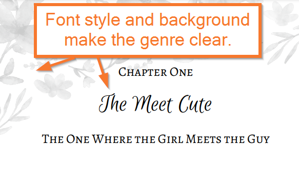
Part 1: Know Your Genre
Source: Atticus
Before you even get started, you should have an understanding of the genre conventions and designs.
Every genre has specific styles of fonts or images that work for that specific mood that you are trying to convey.
For example, a romance novel might use cursive fonts more often, and iconography like hearts and lips are much more acceptable.
By contrast, a science fiction novel might make use of more tech-oriented fonts, as well as artwork that gives off a sense of technology or astronomy.
Whether you're writing a thriller, a western, a romance, or a fantasy, each will have specific designs and styles that are conventional for those genres. Try looking at other books in your genre to see if they have unique chapter themes, and figure out what sets them apart.
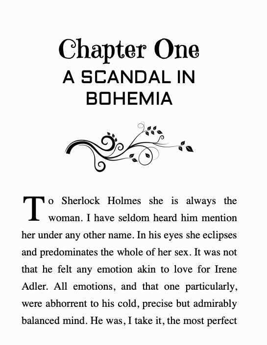
Part 2: The General Layout
Source: Atticus
Next, let's talk about the general layout, because there are many different ways that you can arrange all of the elements in your chapter theme. Those elements are:
- The chapter title
- The chapter number
- The Chapter subtitle
- Background images
- Image elements
Again, not all of these are required, but all can be involved.
Generally, there are three major layouts for chapter themes:
- Text-only
- With a background image
- With an image element
All of the text elements can be rearranged in various orders, but the primary intent of choosing your layout is to decide whether you need an image, and what kind of image you have.
If you have a background image, especially if it is a full bleed background image, your chapter theme will look substantially different when compared to a theme with just an image element embedded around the text elements.
Decide what works for you, and I can move on.
Part 3: The Text Elements
Source: Atticus
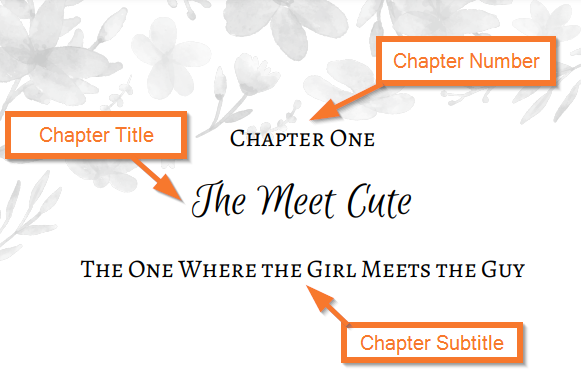
There are three key text elements in any chapter header:
- The Chapter Number
- The Chapter Title
- The Chapter Subtitle
You don’t necessarily have to have all of these in every title. In fact, some (such as the subtitle) are left out more often than not. But it is possible to have all three.
The important thing is to have one element that stands out from the others and draws the eye. If you make all three bold and with fancy fonts, it will seem poorly designed and overcrowded. Instead, pick one element (usually the title or the number) and make it your dominant feature. The others should be simpler, smaller, and complementary.
Let’s dive into what each one offers.
The Chapter Number
The chapter number can show up in several formats. It usually takes the form of a single number, or the word “chapter” followed by the number.
While simple, the chapter number is a key part of your chapter heading, should you choose to include it. If you do, its size and font will be an important part of your chapter theme.
The Chapter Title
Not all chapters have a chapter title. They just go by “chapter 1”, “chapter 2”, etc. but if you have a specific title for every chapter, it becomes an important part of your overall theme.
Typically, this part of your chapter heading uses a larger font size, and you should pay special attention to the style of the font in order to make sure that it fits your genre.
That said, you don’t want to overwhelm the reader with your font, and you also don’t want something that clashes with your book cover’s title font. Something that subtly evokes the genre is fine.
The Chapter Subtitle
Once again, not all chapter themes have a subtitle, but if you do it typically goes below the title, uses a smaller font, easy to read font. You'll also want to make sure that you are using a different font from your title, one that is more legible, smaller in size, and often an opposite style than the title or number.
This means that if your title has a serif, than your subtitle would benefit from a sans serif font to balance it out.
Part 4: Images
There are two different types of images in a chapter header:
- Background images
- Image elements
Additionally, your background images can have a full-bleed effect in a print book, extending all the way to the edges of the page. You can also have a background image that acts as a two-page spread in your print book.
Let’s look at both of these elements individually:
Background Images

Some of the best chapter themes have background images. These are usually light-colored, black and white images that can sit comfortably behind the text and not overpower it.
If you're using a specific program like Atticus to format your books you want to make sure that these background images are cut to specific dimensions to work with the software. Thankfully, a service called Book Brush is built specifically to integrate with Atticus in order to provide these images. Check them out here.
Image Elements
In contrast to background images, an image element can be inserted within the header itself, in or around the title, subtitle, or chapter number.
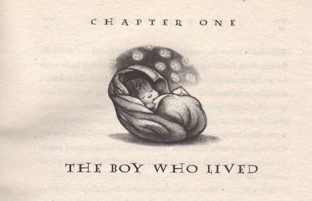
This is usually a simple design that relates thematically to your book in some way, or in rare cases it can relate directly to the chapter you are reading (think the chapter headings of the Harry Potter books).
Part 5: Headers and Footers
Source: Atticus
Lastly, if you are doing a print book, the headers and footers should be part of your theme as well. In some cases you can have special designs surrounding your page numbers (note: adding images or designs around page number is currently not a feature in Vellum or Atticus), and you can change the size and fonts of these elements as well.
As always, these elements should reflect the genre of your book, and should not be too distracting or too large on the page.
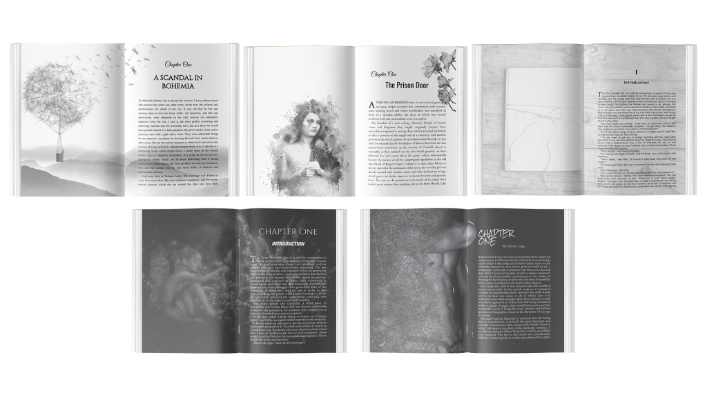
Examples of Beautiful Chapter Headers
There are a variety of styles that you could adopt for your chapter header. Here are just a few examples:
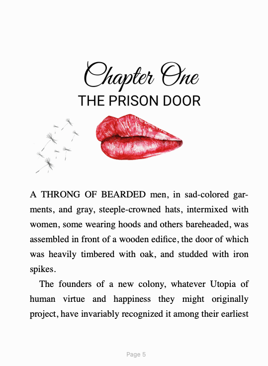
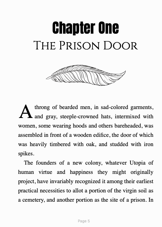
Ebook with Image Element
Ebooks have the advantage of color image elements, even though you can’t have full bleed images for ebooks. But the image elements have a lot of potential, as you can see in these examples:
Print with Full-bleed Image
Print editions with a full-bleed image are some of the most beautiful ways to create amazing chapter themes. While you can’t replicate the effect on an ebook, it’s still a visually impressive look.
Print with Dark Mode
One of the most exciting design possibilities is that of a dark mode. With this, you can have a full-bleed background image that is dark, with white text, instead of the other way around. This can be a fantastic tool for setting the tone in certain genres.
Using Different Images for Each Chapter
If you want to go the extra mile, consider using different images for each chapter, rather than one for everything.
There are a number of advantages you can get from this. It allows you to construct something that is 100% relevant to that specific chapter.
Harry Potter did this with small illustrations that fit the story, but there are many other directions you could take this. Consider, for example:
- A clock or a calendar on each chapter that shows the time when that chapter takes place
- A countdown timer slowly counting down to…something, thus raising the tension
- A tree branch that slowly grows across a two-page spread with each chapter
- A flower that grows with each chapter
- A house that slowly falls into ruin with each chapter
- A spaceship flying across the page, making progress with each chapter
The possibilities are endless, and this is a feature that can only be achieved when you use unique images for each chapter.
Of course, this would cost more to design all those variations, but just think how professional it could make your book look.
What Software Do You Need to Design Beautiful Chapter Headers?
As of this writing, there are three programs capable of designing beautiful chapter themes:
Of those three, Atticus is the cheapest, and it runs on the most platforms. However, Adobe InDesign is the most powerful, but it comes with a steep learning curve.
There are other formatting software out there that will help you create ebooks and print books, but none of these other options (besides the three listed above) are capable of creating chapter themes like those you will see in this article.
How to Create Chapter Themes in Atticus
So I’ve established why you would want a good chapter theme. But how do you actually create one?
In this section, I’ll identify how you can use chapter themes in Atticus, the best formatting software for doing things like this.
Using Pre-Built Themes
If you’re not interested in customizing every piece of your chapter theme, I have good news! Atticus comes equipped with many custom themes, and I am frequently adding more.
Each of these themes has unique fonts, and some of them even have full-bleed backgrounds to really make your chapter theme stand out.
No matter what your genre, I’m sure you’ll be able to find something that you like. However, if you want more fine-tuned control over this process, let’s walk through how you can create amazing chapter themes of your own:
Step 1: Chapter Heading Settings

After opening the formatting tab of your book and selecting “Create New Theme” or selecting an existing theme to customize, the first step is to choose your chapter heading settings.
This lets you choose the font, alignment, and size of each of the following text elements:
- Chapter Number: This should be relatively small and easy to read. In the absence of a title, the chapter number takes its place and should be large and decorated accordingly.
- Chapter Title: This element can have a font that clearly conveys what the genre is, and it should also be the largest text element.
- Chapter Subtitle: If your book has chapter subtitles, they should be smaller than the title and easier to read, but still reminiscent of the appropriate genre.
Spend some time playing around with the different settings here. I’m sure you’ll find one that works for you.
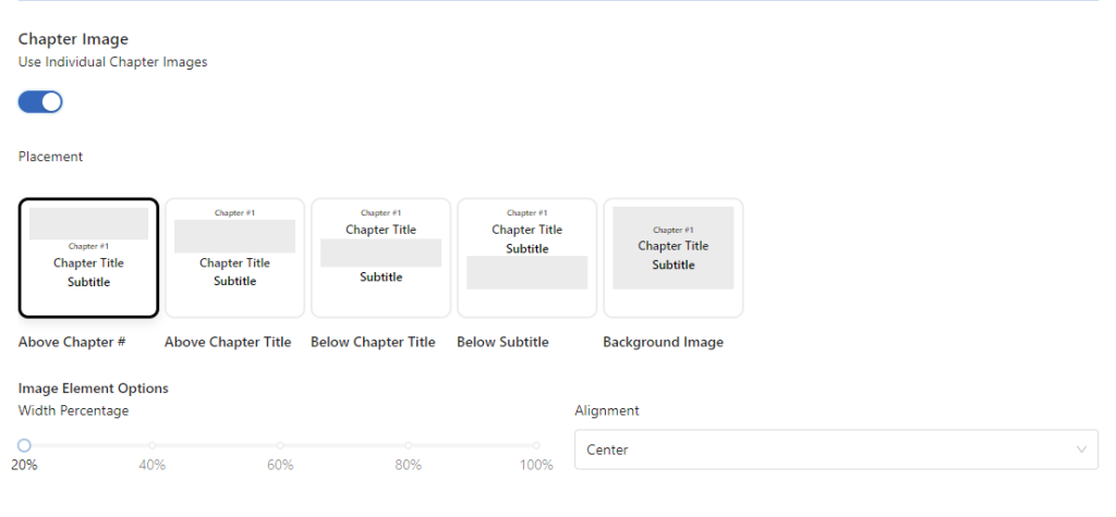
Step 2: The Image Elements
If you’ve checked the “Image” box in Chapter Heading Settings, you’ll get to choose the basic layout of your images.
Firstly, you’ll want to choose whether to have one image for all chapters of your theme, or to use individual chapter images for each chapter (in which case, you’ll need to select those images at the chapter level).
Once you have selected your preference and your image, you have the choice between where to place the image in relation to your chapter number, chapter title, and subtitle.
You can also adjust the alignment and width percentage of each image to your liking.
You can learn more about how to create the best custom themes over on Atticus’ tutorial page.
BONUS: Use Brook Brush to Craft Your Designs

Crafting your book designs can be a meticulous process. Not only do you need to procure good art for the process, but that art has to be in the exact dimensions to use in Atticus.
For example, if you're creating a full bleed image for a 5×8 paperback, that image will have a different size from a book at a 6×9 size, or any other size for that matter.
Additionally, all ornamental breaks, and header images should ideally be in specific sizes.
Thankfully, we've partnered with Book Brush to provide you with templates that make it easy to create those images.
For those who don't know, Book Brush is basically like Canva, but specifically designed for authors. It's one of the best ways to create images, not just for Atticus, but for ad copy and even book covers.
With Atticus, any place where you can upload your images, you'll see a button that looks something like this:

This will automatically take you to the correct sized template, which you can then create in Book Brush.
Final Thoughts
For most authors, I recommend Atticus as the primary tool to create chapter headers. However, those who have Vellum already, or have achieved a mastery of Adobe InDesign, can do so as well.
And if none of these options sound great, you can always hire out a designer and a formatter to do the work for you.
We hope these tips have been useful to you as you upgrade your design know-how and deliver an incredible product to your readers.
Be sure to check out my Book Formatting hub to learn more about how to format your book in a way that will blow the socks of your readers!


