
Choosing an illustration style for a children’s book is not just choosing what looks cute.
Cute might help, depending on the book, but the style is doing a lot more than decorating the pages. It’s shaping how the story feels before a child hears a single sentence. A bright cartoon style tells the reader one thing. A soft watercolor style tells them something else. A sketchy vintage look, a bold digital style, a muted emotional palette, or a realistic approach all create a different kind of reading experience.
And with children’s books, that matters a lot because the illustrations are often carrying half the story.
A young child may not understand every word yet, but they can follow a character’s expression, a change in color, the size of something on the page, or the way a scene feels when they look at it. Parents notice it too, even if they’re not thinking in illustration terms. They can usually tell pretty quickly whether the artwork fits the age group, the tone, and the kind of book they’re holding.
So before you hire an illustrator, or before you start creating the art yourself, it helps to know what direction makes sense for the book. Not just the broad category, like “cartoon” or “realistic,” but also the medium behind it. Watercolor, acrylic, pencil, charcoal, collage, digital painting, and vector art can all change the final feel, even when the story itself stays the same.
Below, I’ll walk through 18 children’s book illustration styles and mediums, with examples of how each one tends to work on the page. The goal is to help you get a clearer sense of what fits your story, your audience, and the kind of book you want someone to pick up and keep reading.
10 illustration styles you’ll see right now
Styles change over time, and what’s popular now won’t look exactly the same a few years from now. But if you spend any time looking at current children’s books, you’ll start to notice the same types of styles showing up again and again.
These are some of the more common ones you’re likely to run into right now.
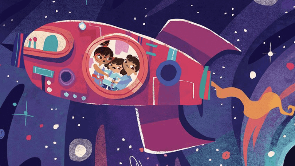
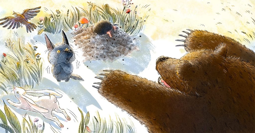
1. Cartoonish illustration style
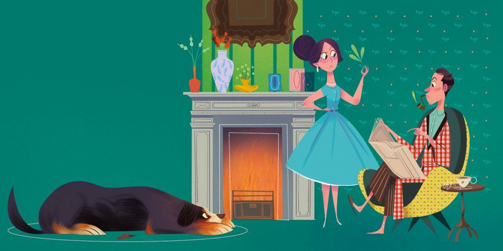
A cartoon style is probably the most common one you’ll see in children’s books, mostly because it’s easy to make it colorful, expressive, and fun to look at.
And it’s not just about bright colors or characters that look like they came out of an animated movie. A lot of the time, it’s about exaggeration. You’ll see animals acting like people, facial expressions pushed a little further than real life, proportions that don’t quite match reality but still feel right on the page. That flexibility makes it easier to match the tone of the story, especially if it leans more playful or lighthearted.
2. Realistic illustration style
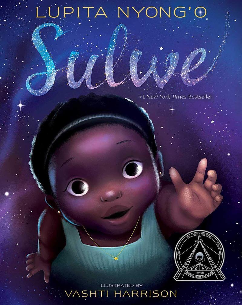
You don’t see fully realistic illustration styles all that often in children’s books, at least not in a strict, photo-like sense.
But there are illustrators who work closer to realism and then adjust it just enough so it still fits the format. So you might get more accurate proportions, more detail, more grounded environments, but still with a bit of softness or stylization layered in. That balance tends to work better than going fully realistic, especially for younger audiences.
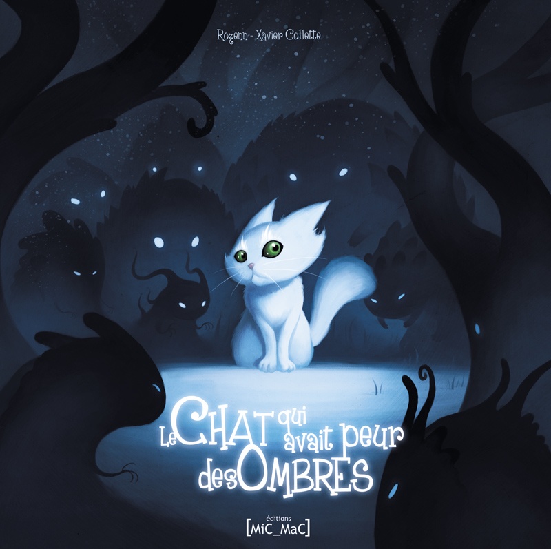
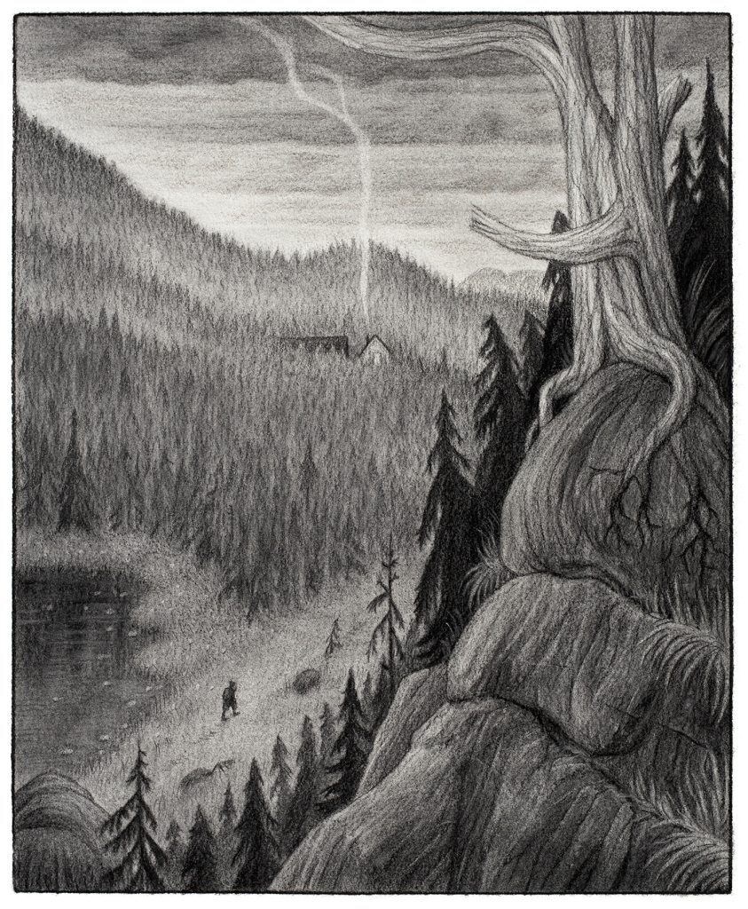
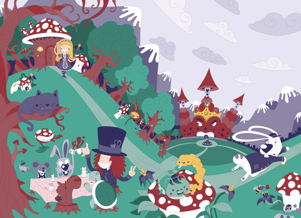
3. Whimsical (fantasy) illustration style
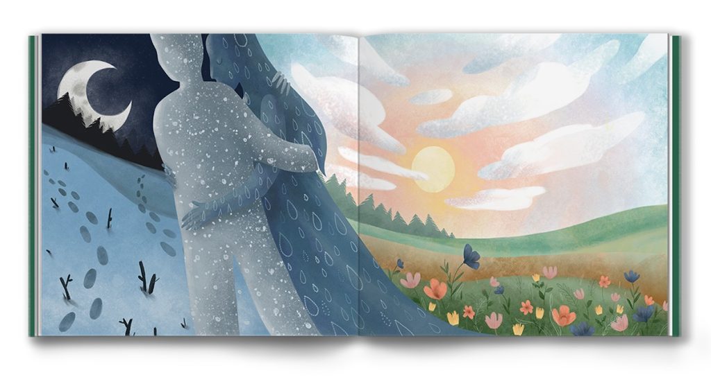
This is where things start to lean more into imagination and less into anything that feels tied to the real world.
You’ll usually see softer shapes, more fluid environments, and a kind of dreamlike quality to everything, where the goal isn’t accuracy but feeling. It’s the kind of style that works well when the story itself is meant to feel a little magical or surreal, where things don’t have to follow strict rules as long as the overall mood comes through.
4. Line drawing style
This one shows up less in traditional children’s books, but you’ll see it a lot in books that double as coloring books or activity books.
It’s a very simple approach on the surface. Mostly clean lines, very little shading, not a lot of detail. But that simplicity is the point, because it leaves space for interaction. The reader, or the child, can fill in the rest, either literally with color or just mentally as they follow along.
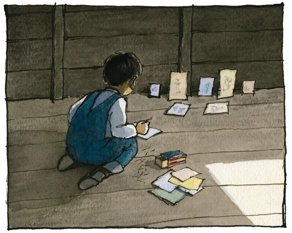
5. Sketch illustration style
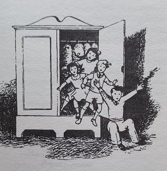
Sketch styles sit somewhere between rough line drawings and more finished illustrations.
You’re usually looking at one dominant color, often black, but with more texture and detail worked in compared to a basic line drawing. There’s a looseness to it that feels a bit more hand-done, and you’ll see it more often in older books or styles inspired by them. It doesn’t feel as polished, but that’s part of the appeal.
6. Abstract illustration style
Abstract styles are a little harder to pin down, mostly because they don’t try to represent things in a straightforward way.
Instead of focusing on accuracy, they lean into shapes, colors, and composition to get the idea across. Sometimes that means exaggeration, sometimes it means simplifying things down, and sometimes it just means approaching the subject from a different angle entirely. It’s one of those styles where it makes more sense once you see it than when you try to define it.
7. Stylized and exaggerated style
This overlaps a bit with abstract, but it usually stays closer to recognizable forms.
You’re still starting with something grounded in reality, but certain features get pushed further than they normally would. Maybe it’s proportions, maybe it’s expressions, maybe it’s scale. The goal is usually to draw attention to specific parts of the scene or character, so the reader knows where to focus without having to think about it.
8. Vintage illustration style
Vintage styles are still popular, partly because they tap into something familiar.
They tend to use softer colors, simpler techniques, and materials like pencil or ink that give everything a slightly older feel. And even when the story itself is new, that style can make it feel more timeless, like it could have been around for a while.
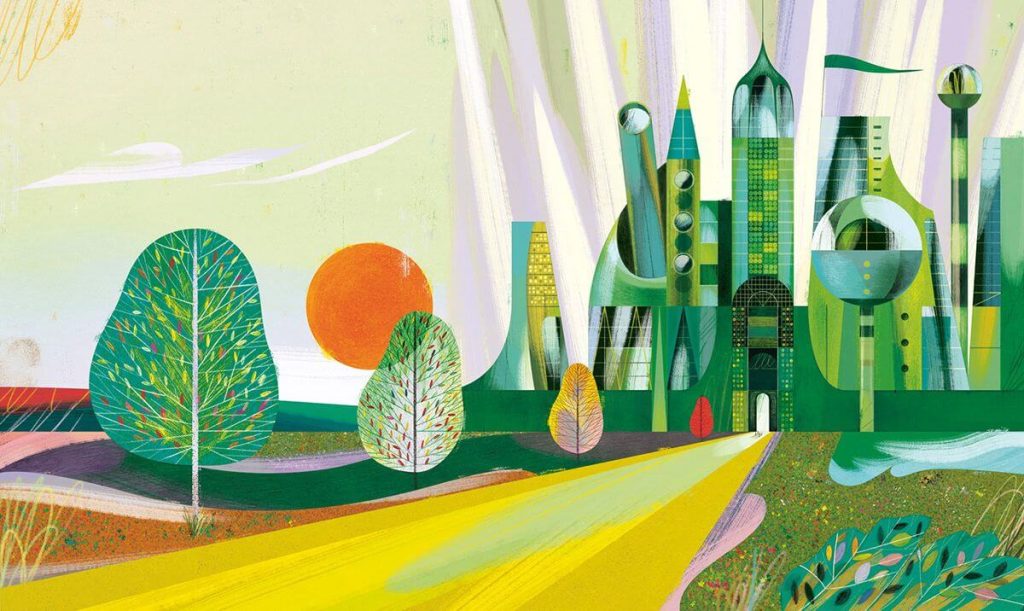
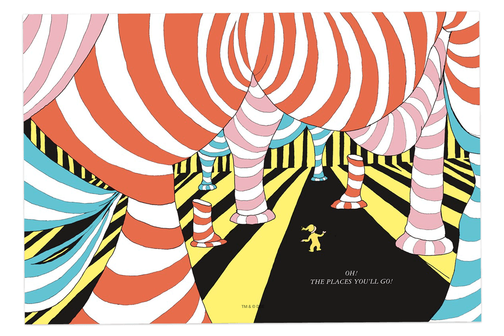
9. Bold and bright illustration style
These are the styles that lean hard into color and contrast.
You’ll see strong palettes, big shapes, and characters or elements that really stand out on the page. Everything is designed to catch attention quickly, which makes it a good fit for stories that are more energetic or fast-paced. It’s not subtle, but it’s not supposed to be.
10. Muted or subdued illustration style
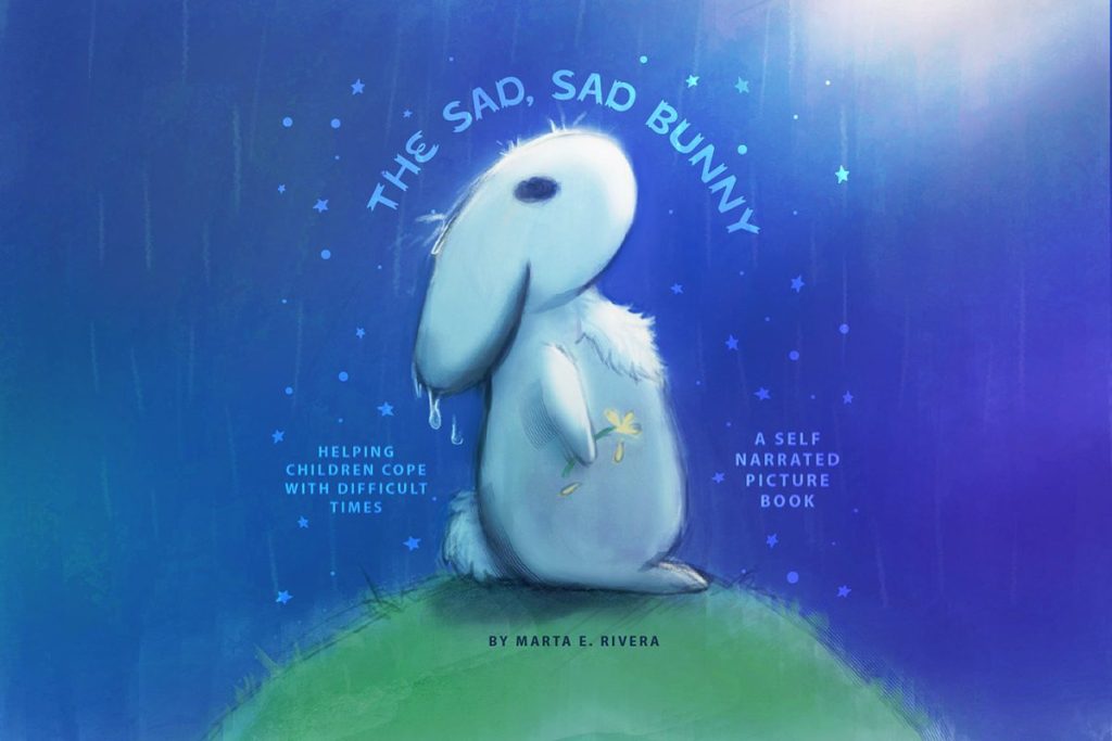
On the other end, you’ve got styles that pull everything back a bit.
The colors are softer, the contrast is lower, and the overall tone is more restrained. That tends to work better for stories that are more emotional or reflective, where you don’t want the visuals competing with the mood. It’s less about grabbing attention and more about supporting what the story is trying to say.
Don't know where to start your children's book? We've got a checklist that will take you through the entire process, from the initial idea to the finished, polished product. Check it out!
8 illustration mediums (and how they shape the look)
Style gets most of the attention, but the medium you use has a big impact on how everything ends up looking on the page.
In some cases, the medium changes things enough that it almost feels like its own style, even if the overall approach is similar. It’s one of those things people don’t always think about at first, but it makes a difference pretty quickly.
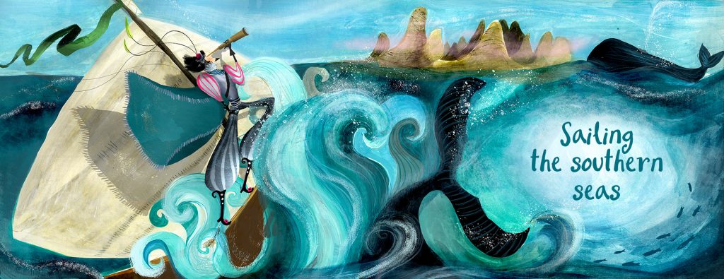
1. Watercolor
Watercolor is one of the most distinct mediums for illustration, as it almost creates its own style. When I was originally writing this post, I almost put watercolor into the styles section, because it is so unique.
However, watercolor is more of a medium, and it can be combined with other mediums such as pencil and acrylic paints.
It's beautiful subdued and gentle colors are often perfect for children's books.
2. Acrylic
When creating physical art, acrylic paint is one of the most common ways to design. It is a relatively clean way to paint, doesn't need long to dry, and can create beautiful and vivid imagery.
3. Pencil art
Believe it or not, the use of black and colored pencils in children's book illustrations is quite common. A lot of older children's books especially, used pencils in a lot of their designs.
Pencils are cheap, they can record a lot of detail, and are a great tool for children's book illustrators in general.
4. Charcoal
For a beautiful and distinct style, try using charcoal.
Charcoal is great for creating bold shadows and illustrations that pop off the page. Children's books that use a heavy amount of charcoal rarely have much color, but they can still be incredibly striking in their style.
5. Collage
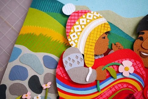
A lot of children's books take a collage approach, where your illustration looks like it has been pieced together from various materials like a scrapbook.
This is another medium that creates a unique-looking style, and is commonly used.
6. Multimedia
Who says that you have to have one medium? There are many books that use a combination of all of these techniques, whether it be digital art and watercolor, watercolor and pencil, charcoal and acrylic, or whatever you want.
7. Digital painting
For books produced today, digital art is possibly the most common way to create children's book illustrations.
There are multiple types of digital illustration (I'll talk about another one below), but the most common are hand-drawn illustrations using something like a digital tablet.
The best thing about digital painting is that it can be adapted to almost any other type of style, and you can mimic most other mediums as well.
8. Vector illustrations
Vector illustrations are a specific type of digital illustration that typically takes on a flat, 3D look.
Vector illustrations are the type that maintain their resolution no matter how large your file. This means that you can expand the size of your illustration to virtually any size, and it will still have an amazing, crisp edge.
Vector illustrations are most commonly created in Adobe Illustrator.
How to choose (and use) an illustration style that works
By this point, you’ve seen a range of styles and mediums, and it’s probably pretty clear there’s no single “right” way to do this.
But if you look at enough children’s books, certain things start to stand out.
Not rules, exactly. More like patterns you keep seeing once you know what to look for. And then once you actually get into working on a book, a few practical things start to matter pretty quickly too.
What good illustrations tend to get right
A lot of this is subjective, but not completely.
For one, the illustrations have to look good on the page. That sounds obvious, but what really matters is that they catch a child’s attention and hold it for a second. That’s usually the first hurdle.
And then there’s memorability. Some styles just stick. You see them once and you can recognize them again later without thinking about it. That tends to come from being a little more distinctive, not just technically well done.
The other big thing is that the illustrations are doing some of the storytelling.
Especially with younger readers, you should be able to flip through the book and still get a sense of what’s happening, even if you ignore the words. If the images aren’t carrying part of that weight, something usually feels off.
Fit matters too, probably more than people expect. The style, the level of detail, the tone… all of that has to line up with the age group. What works for a toddler is not going to land the same way for an older kid.
And then you’ve got expression. Characters need to feel like they’re reacting to things, not just standing there. You should be able to read what they’re feeling without it being spelled out.
Consistency is the last piece people tend to underestimate. Once the style is established, it has to stay that way. If it shifts too much, even a little, it pulls you out of the story.
Things that matter once you start working with an illustrator
Once you move past picking a style, a few more practical things start to come into play.
Audience is a big one. That decision ends up shaping a lot more than people think, from color choices to how detailed things should be to how abstract you can get.
Quality is another one that’s hard to ignore. Illustrations are usually the first thing someone notices, so if they feel rushed or uneven, it shows right away.
It also helps to mix things up a bit visually as you go. Different angles, different layouts, zooming in or pulling back depending on the moment. Not enough to break the overall style, but enough that every page doesn’t feel the same.
At the same time, the text and the images have to feel like they belong together. If they’re doing two different things, it’s noticeable, and not in a good way.
And if you’re working with an illustrator, there’s always that balance. You want a clear direction, but you also don’t want to control every little decision. The good work usually comes from letting them bring something to it, not just executing instructions.
How to think about the book as a whole
This is the part people usually don’t think about until later.
It’s easy to focus on individual illustrations and whether each one looks good on its own. But what matters just as much is how everything fits together across the whole book.
Pacing starts to matter. Some pages are quieter, some are more detailed, some are there to slow things down or set something up.
Page turns matter too. Probably more than you expect. A reveal or a shift in tone can land a lot better if it happens right after a turn instead of right in the middle of a spread.
And then there’s the overall flow from beginning to end. How one spread leads into the next, how the visuals guide the reader without them really noticing it.
A single illustration can look great by itself and still feel out of place if it doesn’t fit that flow.
That’s usually the difference between something that looks good and something that actually works.
Where to find illustrators
Most children’s book illustrators work freelance, so you’re usually going to find them online unless you already have someone in your network.
The obvious places to start are Fiverr and Upwork. Both let you search by style, browse portfolios, compare prices, and see what past clients have said. The range is pretty wide, though, so I wouldn’t choose based on price alone. A cheap illustrator who almost fits the book can end up costing more than a better illustrator who understood the assignment from the beginning.
Reedsy is more curated. You won’t see as many options there, but the illustrators tend to have more direct book experience, which can matter a lot if this is your first children’s book. Someone who already understands spreads, page turns, trim size, and how illustrations work with text may save you a lot of back-and-forth later.
Then you have portfolio sites like IllustrationX, Behance, and DeviantArt. These are useful when you want to browse styles more widely and maybe find someone whose work feels less marketplace-driven. You may have to do more digging, and you may need to reach out directly, but that can be worth it if you’re trying to find a very specific look.
There are also directories like Children’s Illustrators, which are built specifically around this niche. Those can be helpful if you already know you want someone who works in children’s publishing and don’t want to sift through every type of commercial illustration first.
Another good option is to look at children’s books you already like and check who illustrated them. Many illustrators have websites or portfolio pages, and some are open to freelance work even if they’re not heavily advertising it. This is also a useful way to train your eye, because you start noticing which styles feel right for certain age groups, tones, and story types.
Facebook groups, author communities, and referrals can work too, especially if you want to hear from people who have already hired someone. Just make sure you still look at the illustrator’s portfolio carefully. A good recommendation helps, but the work itself has to line up with the book you’re making.
Where you find the illustrator matters less than whether they have the experience, communication style, and portfolio to handle the project well.
Choose the style that fits the book
A children’s book illustration style should feel like it belongs to the story.
That sounds obvious, but it’s easy to get pulled toward artwork you personally like and forget to ask whether it fits the book you’re making. A silly bedtime story, a quiet book about grief, a high-energy toddler book, and a detailed adventure for older children are all going to ask for different visual choices.
So as you look through the styles and mediums above, pay attention to what each one does on the page.
Cartoonish art can make a book feel playful and expressive. Watercolor can soften the mood. Bold digital work can grab attention quickly. Sketch or vintage styles can make the book feel quieter, older, or more classic. None of these are automatically better than the others. They just create different expectations for the reader.
The age group matters too. Younger children usually need clearer expressions, simpler visual storytelling, and artwork that helps them follow what’s happening even when they don’t catch every word. Older children can usually handle more detail, subtler emotion, and busier scenes.
The best style is the one that supports the story instead of fighting it.
Once you know the kind of reading experience you’re trying to create, the illustrator search gets easier because you’re not just looking for “good art.” You’re looking for the kind of art that makes this particular book work.
Get that part close, and the illustrations have a much better chance of doing what they’re supposed to do: pull the reader into the story before the words even start.


